Overcoming hesitation with clarity and trust
Nordolia
Nordolia is an online interior design and decor store with years of experience in the eCommerce space. Despite consistent operations and a strong product catalog, growth had stagnated — sales and traffic remained flat, and conversion rates were no longer improving.
In a crowded market dominated by well-known Scandinavian design brands, Nordolia needed to stand out — and more importantly, build trust and reduce friction in the buying process.
The Challenge
A Great Catalog Held Back by Doubt
When Nordolia approached us, the surface-level issue seemed to be about traffic and demand. But digging deeper, we found that the real barrier was conversion — specifically, the number of users adding products to their carts was far below industry benchmarks for home & interior retail.
Using a combination of tools and methods:
Heatmaps and scroll tracking to study page-level behavior
Customer support insights to uncover frequent user questions and hesitations
Analytics review to map drop-offs and missed intent
…we discovered two recurring issues:
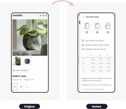
Uncertainty about product sizes — Many of Nordolia’s products are larger or vary widely in dimension, and this wasn’t clearly communicated on the product pages.
Lack of perceived credibility — Compared to bigger household-name competitors, Nordolia’s site lacked visual trust signals like reviews or testimonials, which are key when the brand itself isn’t yet widely recognized.
Together, these concerns created a subtle but significant hesitation — and it was enough to break the flow of potential purchases.
Suggested graphic:
A screenshot of a product page with callouts showing “missing reviews,” “unclear sizing,” and “bare trust section.”
A short bar chart comparing typical vs. Nordolia’s add-to-cart rate.
The Solution
Build Trust & Remove Friction
We mapped out a strategy built on low-effort, high-impact experiments designed to:
Increase trust and credibility
Remove sizing ambiguity
Reinforce user confidence at key moments
Over a few weeks, we implemented and tested five different interventions, including:
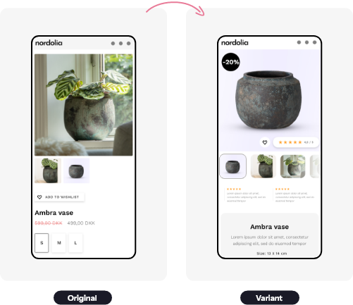
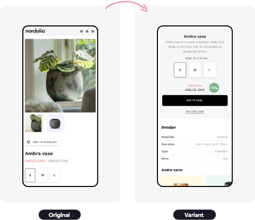
Adding visual product reviews to key product pages, using UGC (user-generated content) where available
Displaying star ratings on collection pages, to provide immediate credibility signals
Introducing a clear, consistently formatted size guide placed directly next to the “Add to Cart” button
Tweaking layout spacing and visual hierarchy to make the pages feel more polished and high-end
Highlighting Nordolia’s customer service promise, shipping transparency, and satisfaction guarantee
Each of these changes was A/B tested to ensure they didn’t just look good — they performed.
Suggested graphic:
A screenshot comparison of before/after product page designs
A visual checklist of UX trust boosters added to the site
Results
More Trust, More Clicks, More Revenue
Out of the five experiments we ran, three produced statistically significant wins, with clear and measurable business outcomes:
+14.5% increase in Add-to-Cart rate
+22.3% increase in sales
Improved scroll depth and time on page — indicating higher engagement and stronger user confidence
The improvements were especially strong on mobile, where small visual signals like reviews and size clarity matter even more. These seemingly small tweaks gave customers the extra push they needed to move forward.
For Nordolia, the key wasn’t more ads or bigger campaigns — it was about creating a smoother, more reassuring experience for the traffic they already had.
Suggested graphic:
Line graph of Add-to-Cart and Sales over time during the test
Quote pullout (placeholder):
“Our products were never the issue — people just needed a bit more clarity and confidence. The changes OpenConvert made had a real impact.” – Nordolia Team
Ready to take the
next step?
Then we are right answer
- When increasing ad-spend no longer works
- When you want to understand your users
- If you are a D2C e-commerce store
- If your traffic is over 5000 visitors/mo